Published On:Wednesday, 14 December 2011
Posted by Muhammad Atif Saeed
Graphic Displays
Introduction to Graphic Displays
Pie charts and bar charts are graphic displays of data for categorical variables. Dot plots, stem-and-leaf plots, histograms, and box-and-whisker plots are graphic displays of data for numerical variables.As an example, consider the yearly expenditures of a college undergraduate. After collecting her data (expense records) for the past year, she finds the expenditures shown in Table 1.
| Item | Amount |
|---|---|
| Tuition fees | $5,000 |
| Room and board | $9,000 |
| Books and lab | $2,000 |
| Clothes/cleaning | $1,000 |
| Transportation | $2,000 |
| Insurance and miscellaneous | $1,000 |
Bar Chart
One way to pictorially display the numbers shown in Table 1 in "What Are Graphic Displays for Statistics?" is with a bar chart (see Figure 1).
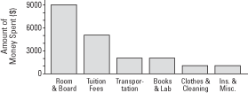 Comparing the size of the bars, you can quickly see that room-and-board expenses are nearly double the tuition fees, and tuition fees are more than double the expenses for books and lab and transportation.
A bar chart also may be placed on its side with the bars going horizontally, as shown in Figure 2.
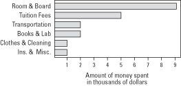 In each bar chart, vertical or horizontal, the amounts are ordered from highest to lowest or lowest to highest, making the chart clearer and easier to understand. Space is left between each of the bars in order to define the categories as being different.
The bottom line in Figure 1 and the left side in Figure 2 indicate 0. Although typical, this presentation need not always be used. Finally, although the lengths of the bars may be different, their thicknesses are the same.
Figure 1. Vertical bar chart presentation of the expenditures of a college undergraduate for the past year.

A bar chart also may be placed on its side with the bars going horizontally, as shown in Figure 2.
Figure 2. Horizontal bar chart presentation of the expenditures of a college undergraduate for the past year.

The bottom line in Figure 1 and the left side in Figure 2 indicate 0. Although typical, this presentation need not always be used. Finally, although the lengths of the bars may be different, their thicknesses are the same.
Pie Chart
Bar charts have a limitation: It is difficult to see what portion of the total each item comprises. If knowing about a part of the whole is an important consideration, a pie chart is a better choice for showing the same data. A pie chart also may display each category's percentage of the total. Using the same data from the undergraduate expenditures, we get the pie chart shown in Figure 1.
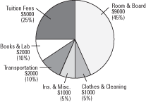 The parts of the circle (or pie) match in size each category's percentage of the total. The parts of the pie chart are ordered from highest to lowest for easier interpretation of the data. Pie charts work best with only a few categories; too many categories make a pie chart confusing.
Figure 1. Pie chart presentation of the expenditures of a college undergraduate for the past year.

Dot Plot
Dot plots are used for quantitative variables. Typically used for a small set of values, a dot plot uses a dot for each unit of measurement. For the preceding undergraduate expense data, if we just wanted to compare the dollar values and were not concerned with the categories, a dot plot would look like that shown in Figure 1.

Figure 1. Dot plot of the expenditures of a college undergraduate for the past year.

Ogive
Data may be expressed using a single line. An ogive (a cumulative line graph) is best used when you want to display the total at any given time. The relative slopes from point to point will indicate greater or lesser increases; for example, a steeper slope means a greater increase than a more gradual slope. An ogive, however, is not the ideal graphic for showing comparisons between categories because it simply combines the values in each category, thus indicating an accumulation (a growing or lessening total). If you simply want to keep track of a total and your individual values are periodically combined, an ogive is an appropriate display.
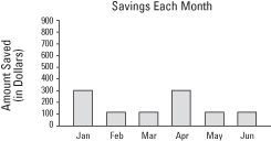
For example, if you saved $300 in both January and April and $100 in each of February, March, May, and June, an ogive would look like Figure 1.
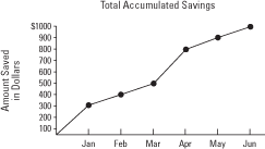 An ogive displays a running total. Although each individual month's savings could be expressed in a bar chart (as shown in Figure 2), you could not easily see the amount of total growth or loss, as you can in an ogive.
 The choice of graphic display, therefore, depends on what information is important for your purposes: percentages (parts of the whole), running total, comparisons of categories, and so forth.
For example, if you saved $300 in both January and April and $100 in each of February, March, May, and June, an ogive would look like Figure 1.
Figure 1. Ogive of accumulated savings for one year.

Figure 2. Vertical bar chart of accumulated savings for one year.

Frequency Histogram
One of the more commonly used pictorials in statistics is the frequency histogram, which in some ways is similar to a bar chart and tells how many items are in each numerical category. For example, suppose that after a garage sale, you want to determine which items were the most popular: the high-priced items, the low-priced items, and so forth. Let's say you sold a total of 32 items for the following prices: $1, $2, $2, $2, $5, $5, $5, $5, $7, $8, $10, $10, $10, $10, $11, $15, $15, $15, $19, $20, $21, $21, $25, $25, $29, $29, $29, $30, $30, $30, $35, and $35.
The items sold ranged in price from $1 to $35. First, divide this range of $1 to $35 into a number of categories, called class intervals. Typically, no fewer than 5 and no more than 20 class intervals work best for a frequency histogram.
Choose the first class interval to include your lowest (smallest value) data and make sure that no overlap exists so that one piece of data does not fall into two class intervals. For example, you would not have your first class interval be $1 to $5 and your second class interval be $5 to $10 because the four items that sold for $5 would belong in both the first and the second intervals. Instead, use $1 to $5 for the first interval and $6 to $10 for the second. Class intervals are mutually exclusive.
First, make a table of how your data is distributed (see Table 1). The number of observations that falls into each class interval is called the class frequency.
Note that each class interval has the same width. That is, $1 to $5 has a width of five dollars, inclusive; $6 to $10 has a width of five dollars, inclusive; $11 to $15 has a width of five dollars, inclusive; and so forth. From the data, a frequency histogram would look like what you see in Figure 1.
Figure 1. Frequency histogram of items sold at a garage sale.
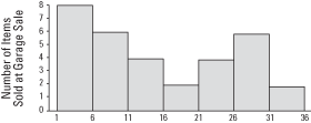
Unlike in a bar chart, the class intervals are drawn immediately adjacent to each other.
The items sold ranged in price from $1 to $35. First, divide this range of $1 to $35 into a number of categories, called class intervals. Typically, no fewer than 5 and no more than 20 class intervals work best for a frequency histogram.
Choose the first class interval to include your lowest (smallest value) data and make sure that no overlap exists so that one piece of data does not fall into two class intervals. For example, you would not have your first class interval be $1 to $5 and your second class interval be $5 to $10 because the four items that sold for $5 would belong in both the first and the second intervals. Instead, use $1 to $5 for the first interval and $6 to $10 for the second. Class intervals are mutually exclusive.
First, make a table of how your data is distributed (see Table 1). The number of observations that falls into each class interval is called the class frequency.
| Class | Interval | Frequency |
|---|---|---|
| 1 | $1 to $5 | 8 |
| 2 | $6 to $10 | 6 |
| 3 | $11 to $15 | 4 |
| 4 | $16 to $20 | 2 |
| 5 | $21 to $25 | 4 |
| 6 | $26 to $30 | 6 |
| 7 | $31 to $35 | 2 |
Figure 1. Frequency histogram of items sold at a garage sale.

Unlike in a bar chart, the class intervals are drawn immediately adjacent to each other.
Relative Frequency Histogram
A relative frequency histogram uses the same information as a frequency histogram but compares each class interval to the total number of items. For example, the first interval ($1 to $5) contains 8 out of the total of 32 items, so the relative frequency of the first class interval is  (see Table 1).
The only difference between a frequency histogram and a relative frequency histogram is that the vertical axis uses relative or proportional frequency instead of simple frequency (see Figure 1).
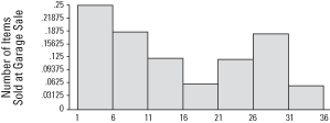
 (see Table 1).
 | Class | Interval | Frequency | Relative Frequency |
|---|---|---|---|
| 1 | $1 to $5 | 8 | 0.25 |
| 2 | $6 to $10 | 6 | 0.1875 |
| 3 | $11 to $15 | 4 | 0.125 |
| 4 | $16 to $20 | 2 | 0.0625 |
| 5 | $21 to $25 | 4 | 0.125 |
| 6 | $26 to $30 | 6 | 0.1875 |
| 7 | $31 to $35 | 2 | 0.0625 |
Figure 1. Relative frequency histogram of items sold at a garage sale.

Frequency Polygon
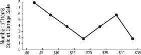
Relative frequencies of class intervals also can be shown in a frequency polygon. In this chart, the frequency of each class is indicated by points or dots drawn at the midpoints of each class interval. Those points are then connected by straight lines.
Comparing the frequency polygon (shown in Figure 1) to the frequency histogram (refer to Figure 1 in "Frequency Histogram"), you see that the major difference is that points replace the bars.
 Whether to use bar charts or histograms depends on the data. For example, you may have categorical (or qualitative) data—numerical information about categories that vary significantly in kind. Gender (male or female), types of automobile owned (sedan, sports car, pickup truck, van, and so forth), and religious affiliations (Christian, Jewish, Muslim, and so forth) are all qualitative data. On the other hand, quantitative data can be measured in amounts: age in years, annual salaries, inches of rainfall. Typically, qualitative data are better displayed in bar charts; quantitative data, in histograms.
Comparing the frequency polygon (shown in Figure 1) to the frequency histogram (refer to Figure 1 in "Frequency Histogram"), you see that the major difference is that points replace the bars.
Figure 1. Frequency polygon display of items sold at a garage sale.

Frequency Distribution
Frequency distributions are like frequency polygons (refer to Figure 1 in "Frequency Polygon"); however, instead of straight lines, a frequency distribution uses a smooth curve to connect the points and, similar to a graph, is plotted on two axes: The horizontal axis from left to right (or x-axis) indicates the different possible values of some variable (a phenomenon where observations vary from trial to trial). The vertical axis from bottom to top (or y-axis) measures frequency or how many times a particular value occurs.
For example, in Figure 1, the x-axis might indicate annual income (the values would be in thousands of dollars); the y-axis might indicate frequency (millions of people or percentage of working population). Notice that in Figure 1, the highest percentage of the working population would, thus, have an annual income in the middle of the dollar values. The lowest percentages would be at the extremes of the values: nearly 0 and extremely high.
 Notice that this frequency curve displays perfect symmetry; that is, one half (the left side) is the mirror image of the other half (the right side). Not all frequency curves are perfectly symmetrical.
Figure 2 shows a J-shaped curve.
 Unlike Figure 1, a bimodal curve (shown in Figure 3) has two high points.

For example, in Figure 1, the x-axis might indicate annual income (the values would be in thousands of dollars); the y-axis might indicate frequency (millions of people or percentage of working population). Notice that in Figure 1, the highest percentage of the working population would, thus, have an annual income in the middle of the dollar values. The lowest percentages would be at the extremes of the values: nearly 0 and extremely high.
Figure 1. A symmetric bell curve.

Figure 2 shows a J-shaped curve.
Figure 2. J-shaped curve.

Figure 3. A bimodal curve has two maximum peaks.

Stem-and-Leaf
Another useful pictorial is the stem-and-leaf. It is similar to a histogram in that it shows the range of data, where the data are concentrated, if there are any outliers (occasional extremely high or extremely low scores), and the general shape of the distribution.
For example, look at the following data—test scores of 17 high school students: 69, 75 , 77, 79, 82, 84, 87, 88, 89, 89, 89, 90, 91, 93, 96, 100, and 100. The stem-and-leaf takes all but the last digit of each score as the stem and uses the remaining digit as the leaf.
As an example, for the score of 69, the 6 is the stem and the 9 is the leaf; for the next three grades (75, 77, and 79), 7 is the stem, and 5 , 7, and 9 are the leaves.
Note, too, that along the extreme left side of the chart is a vertical column that keeps a running count or total. (Some stem-and-leafs do not include this running total.) Having a running total enables the reader to quickly locate the median.
The completed stem-and-leaf for the high school students' test scores looks like Table 1.
Notice that, like a histogram, each stem determines a class interval and, also like a histogram, the class intervals are all equal. (In this case, each interval width is from a possible low of 0 to a possible high of 9.) All 17 scores are displayed in the stem-and-leaf so that you can see not only the frequencies and the shape of the distribution but also the actual value of every score.
For example, look at the following data—test scores of 17 high school students: 69, 75 , 77, 79, 82, 84, 87, 88, 89, 89, 89, 90, 91, 93, 96, 100, and 100. The stem-and-leaf takes all but the last digit of each score as the stem and uses the remaining digit as the leaf.
As an example, for the score of 69, the 6 is the stem and the 9 is the leaf; for the next three grades (75, 77, and 79), 7 is the stem, and 5 , 7, and 9 are the leaves.
Note, too, that along the extreme left side of the chart is a vertical column that keeps a running count or total. (Some stem-and-leafs do not include this running total.) Having a running total enables the reader to quickly locate the median.
The completed stem-and-leaf for the high school students' test scores looks like Table 1.
| Running Count | Stem | Leaves |
|---|---|---|
| 1 | 6 | 9 |
| 4 | 7 | 5, 7, 9 |
| 11 | 8 | 2, 4, 7, 8, 9, 9, 9 |
| 15 | 9 | 0, 1, 3, 6 |
| 17 | 10 | 0, 0 |
Box Plot (Box-and-Whiskers)
Box plots, sometimes called box-and-whiskers, take the stem-and-leaf one step further. A box plot will display a number of values of a distribution of numbers:
The median (the middle value in a set that has been ordered lowest to highest) is the value above which half of the remaining values fall and below which the other half of the remaining values fall. Because there is an even number of scores in our example (20), the median score is the average of the two middle scores (10th and 11th)—580 and 600—or 590.
The lower quartile ( Q1or 25th percentile) is the median of the bottom half. The bottom half of this set consists of the first ten numbers (ordered from low to high): 280, 340, 440, 490, 520, 540, 560, 560, 580, and 580. The median of those ten is the average of the fifth and sixth scores—520 and 540—or 530. The lower-quartile score is 530.
The upper quartile ( Q3or 75th percentile) is the median score of the top half. The top half of this set consists of the last ten numbers: 600, 610, 630, 650, 660, 680, 710, 730, 740, and 740. The median of these ten is again the average of the fifth and sixth scores—in this case, 660 and 680—or 670. So 670 is the upper-quartile score for this set of 20 numbers.
A box plot can now be constructed as follows: The left side of the box indicates the lower quartile; the right side of the box indicates the upper quartile; and the line inside the box indicates the median. A horizontal line is then drawn from the lowest value of the distribution through the box to the highest value of the distribution. (This horizontal line is the “whiskers.”)
Using the Verbal SAT scores in Table 1, a box plot would look like Figure 1.
Figure 1. A box plot of SAT scores displays median and quartiles.

Without reading the actual values, you can see by looking at the box plot in Figure 1 that the scores range from a low of 280 to a high of 740; that the lower quartile ( Q1) is at 530; that the median is at 590; and that the upper quartile ( Q3) is at 670. Because the median is slightly nearer the lower quartile than the upper quartile and the interquartile range is situated far to the right of the range of values, the distribution departs from symmetry.
- The median value
- The lower quartile ( Q1)
- The upper quartile ( Q3)
- The interquartile range ( IQR), the distance between the lower and upper quartiles
- The symmetry of the distribution
- The highest and lowest values
| 280 | 340 | 440 | 490 | 520 | 540 | 560 | 560 | 580 | 580 |
| 600 | 610 | 630 | 650 | 660 | 680 | 710 | 730 | 740 | 740 |
The lower quartile ( Q1or 25th percentile) is the median of the bottom half. The bottom half of this set consists of the first ten numbers (ordered from low to high): 280, 340, 440, 490, 520, 540, 560, 560, 580, and 580. The median of those ten is the average of the fifth and sixth scores—520 and 540—or 530. The lower-quartile score is 530.
The upper quartile ( Q3or 75th percentile) is the median score of the top half. The top half of this set consists of the last ten numbers: 600, 610, 630, 650, 660, 680, 710, 730, 740, and 740. The median of these ten is again the average of the fifth and sixth scores—in this case, 660 and 680—or 670. So 670 is the upper-quartile score for this set of 20 numbers.
A box plot can now be constructed as follows: The left side of the box indicates the lower quartile; the right side of the box indicates the upper quartile; and the line inside the box indicates the median. A horizontal line is then drawn from the lowest value of the distribution through the box to the highest value of the distribution. (This horizontal line is the “whiskers.”)
Using the Verbal SAT scores in Table 1, a box plot would look like Figure 1.
Figure 1. A box plot of SAT scores displays median and quartiles.

Without reading the actual values, you can see by looking at the box plot in Figure 1 that the scores range from a low of 280 to a high of 740; that the lower quartile ( Q1) is at 530; that the median is at 590; and that the upper quartile ( Q3) is at 670. Because the median is slightly nearer the lower quartile than the upper quartile and the interquartile range is situated far to the right of the range of values, the distribution departs from symmetry.
Scatter Plot
Sometimes you want to display information about the relationship involving two different phenomena. These data would be called bivariate or paired data. For example, suppose you collected data about the number of days that law-school candidates studied for a state bar examination and their resulting scores on the exam. The data from eight candidates is shown in Table 1.
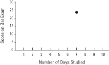
One dot would then be plotted for each examinee, giving a total of only eight dots, yet displaying 16 pieces of numerical information. For example, Candidate 1 studied for seven days and received a score of 23. Candidate 1's dot would be plotted at a vertical of 23 and a horizontal of 7 (see Figure 1).
 A completed scatter plot would look like Figure 2.
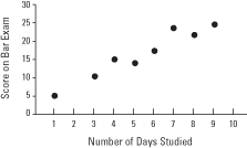 There is a strong positive relationship between the number of days studied and the score on the bar exam; that is, the data displayed indicates that an increase in days studied for the exam correlates with an increase in score achieved. A negative relationship would be indicated if the dots suggested a line going down from left to right, meaning that as one variable increases, the other decreases. And no relationship would be indicated if the scatter plot dots suggested a completely horizontal line, a completely vertical line, or no line at all (see Figure 3).
| Candidate | 1 | 2 | 3 | 4 | 5 | 6 | 7 | 8 |
|---|---|---|---|---|---|---|---|---|
| Days studied | 7 | 9 | 5 | 1 | 8 | 4 | 3 | 6 |
| Score earned | 23 | 25 | 14 | 5 | 22 | 15 | 11 | 17 |
Figure 1. A representative point of data on a scatter plot.

Figure 2. A scatter plot displaying the relationship between preparation time and test score.

Figure 3. Scatter plots that display no relationship between the variables plotted.


